Struggling to get leads and conversions? Here are 10 tips to help you perfect your homepage design!
Tip #1: Get your welcome panel right
It’s the first thing the prospect sees, so make sure it’s designed to immediately answer the most important question on their mind: ‘what’s in it for me?’. Otherwise, they’ll go elsewhere.
Studies show that you only get about 50 milliseconds to make a great first impression, so you better make it count. Here’s what you need to include at a minimum to give yourself the best chance at making a lasting impression;
- Make sure your logo is clearly visible so people know that they have landed in the right place.
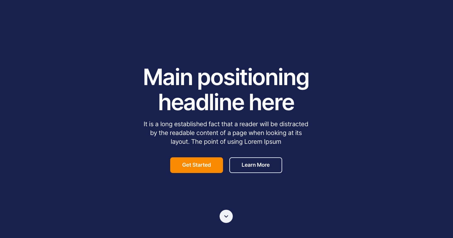
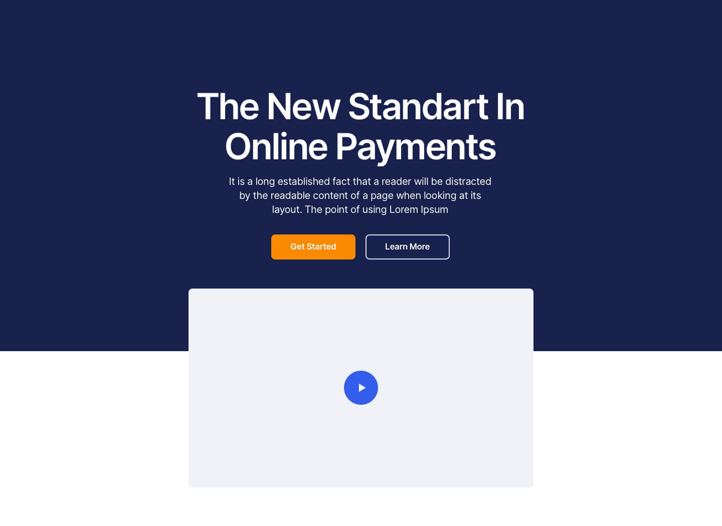
- Have a clear positioning statement that explains who you are, how you benefit the user and how they can get started.
- A clear next step for users ready to get started and for users who need a bit more information first.
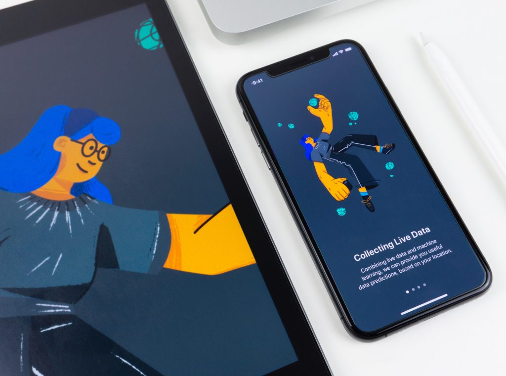
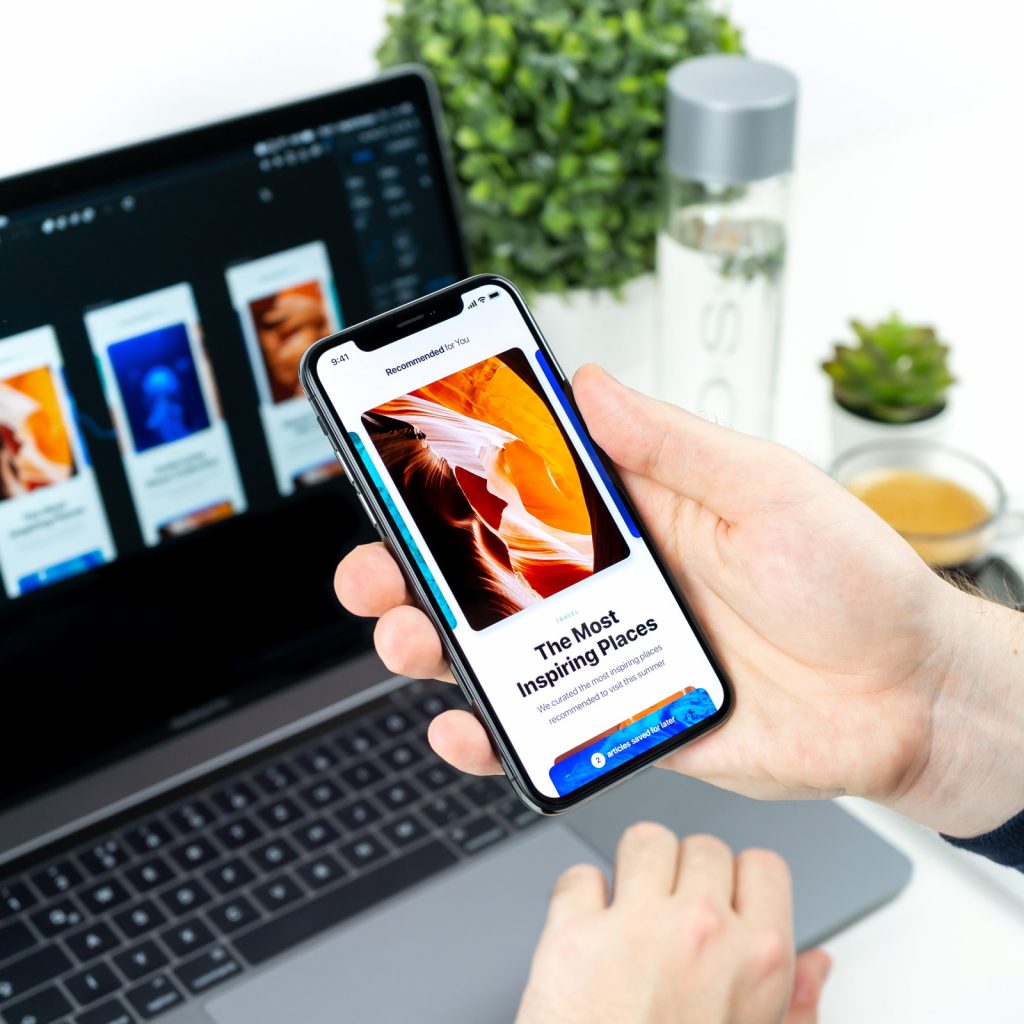
- A great image or video to capture attention.
Here’s some examples you could glean some ideas from:
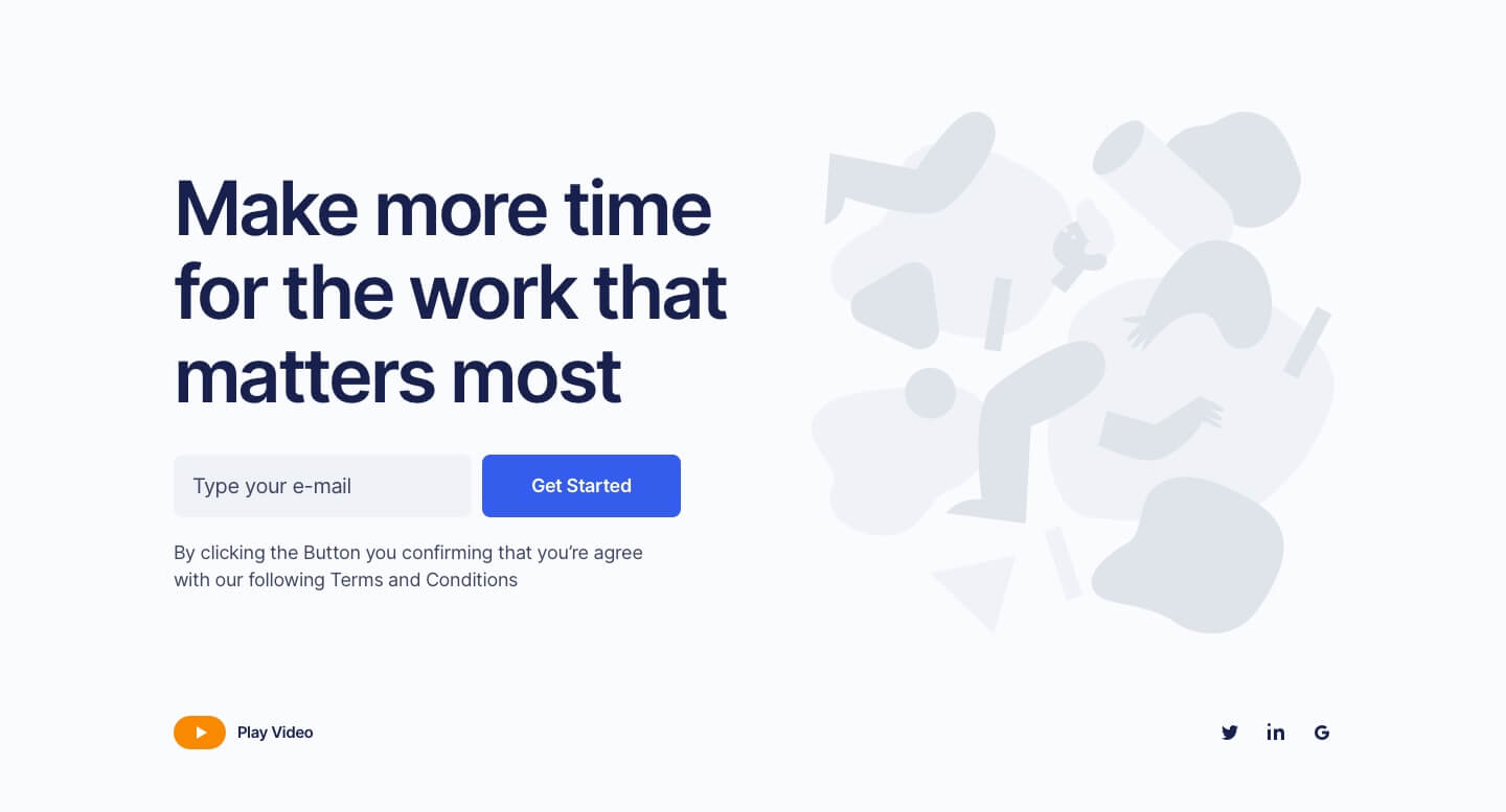
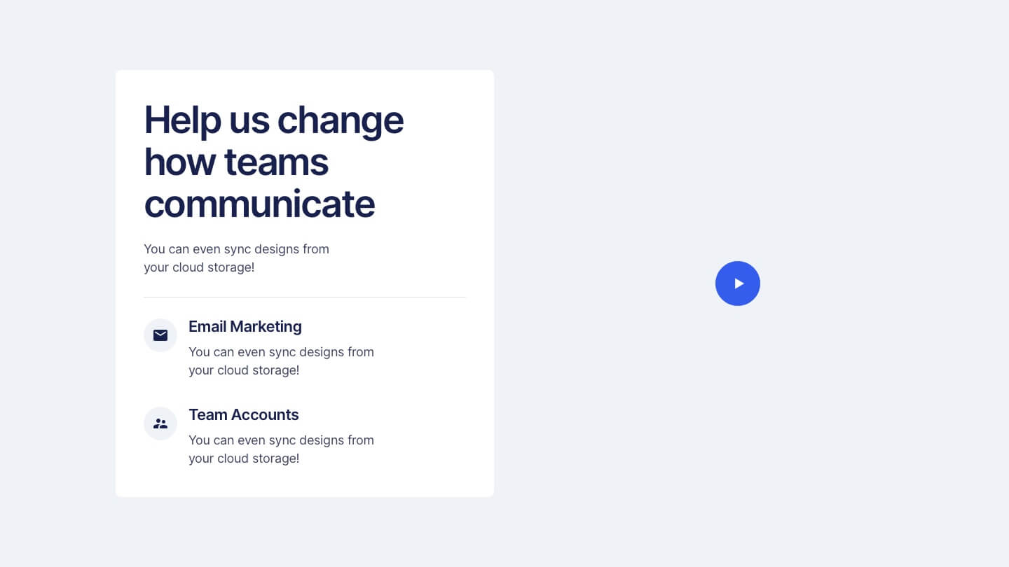
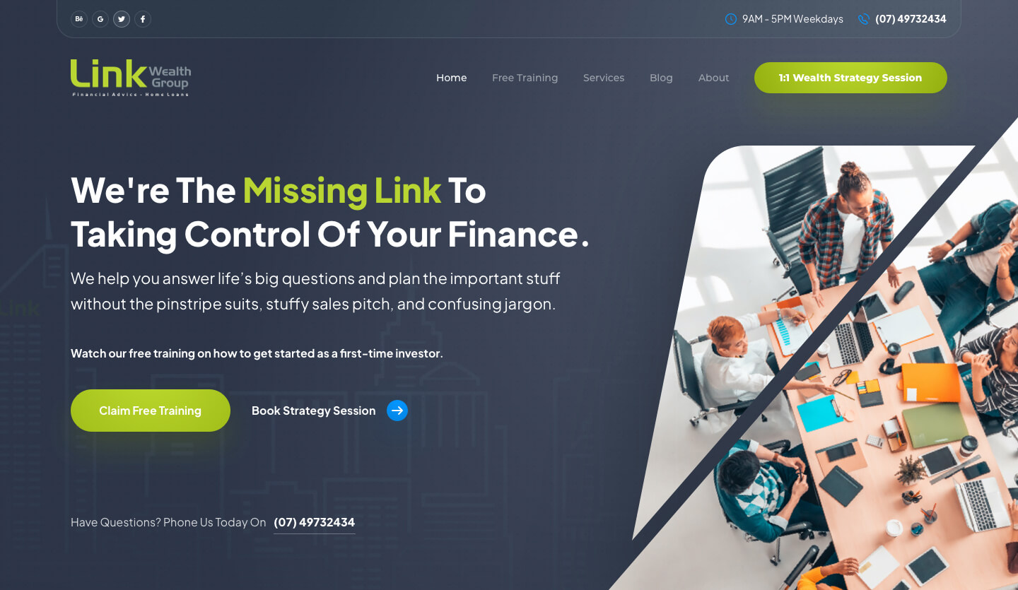
A: Simple background image or video with positioning statement and call to actions laid over the top of the graphics.
B: Similar to the previous panel but with a featured video
C: Left aligned text with the subject of the image on the right hand side.
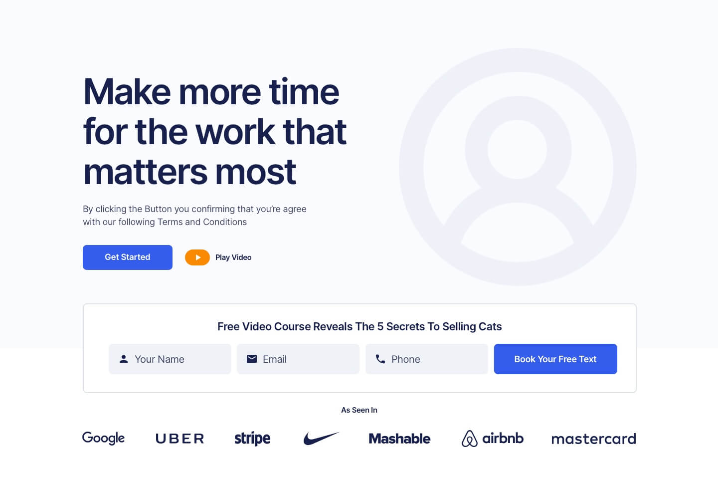
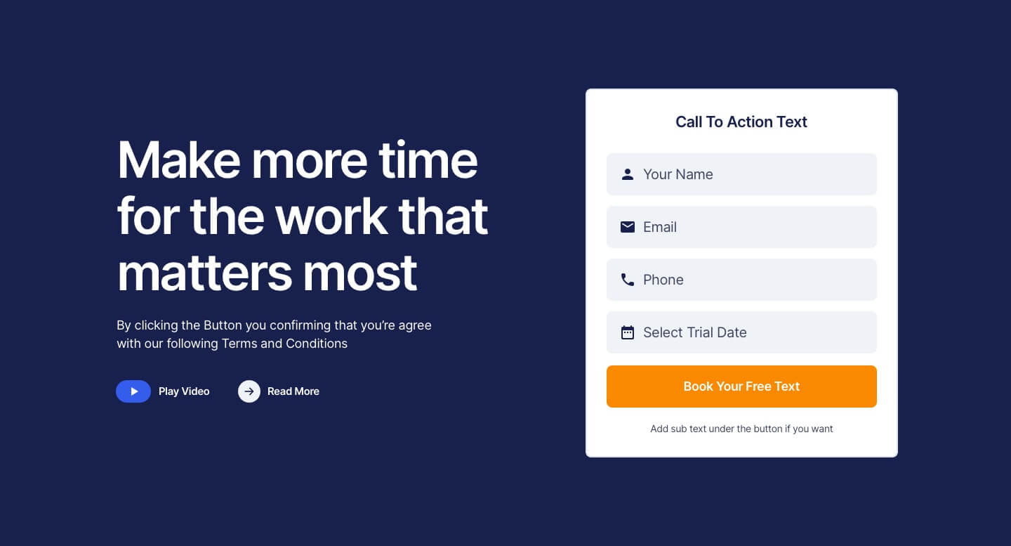
D: Similar to the previous panel but with an opt-in form above the fold.
E: Here’s what you can do if you have some key benefits you don’t want anyone to miss.
Tip #2: Show the prospect where to go
Of course, just because the prospect knows what you’re selling and why they need it doesn’t mean they’ll know what to do next. You need to guide them throughout the journey using intuitive design and clear, compelling calls to action.
Here’s a simple example of how you can reiterate the offers you made on the welcome panel lower down on the page.

Or add some more interest with some graphics like this.
Tip #3: Provide lots of free value up front
According to Chet Holmes’ The Buyers Pyramid, only 3% of all your prospects are ready to buy at any given moment. This means that if you focus too much on selling, you’ll miss out on the chance to close the other 97%.
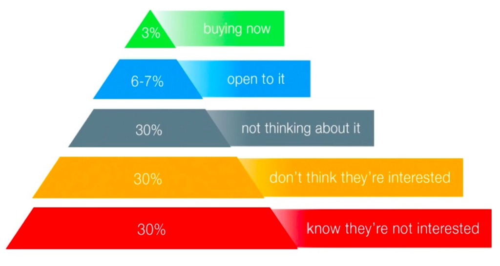
This is why it’s essential to also put out lots of valuable free content in the form of blog posts, videos, Q&A sessions, and even consultations.
Doing so not only allows you to not only position yourself as an authority in your industry, but also build relationships with your prospects, ultimately making closing deals so much easier.
Tip #4: Use lead magnets
Speaking of free content, you can also use them in your homepage design to easily capture leads. All you have to do is gate some of your most valuable digital assets so prospects have to provide their contact details in exchange for access.
Here are some examples of great lead magnets to help you get started:
- eBooks
- Reports
- Swipe files
- Pre-recorded webinars
- Checklists
- Templates
- Free trials
- Video series
- Free samples
…and many more.
The idea here is to only use pre-made assets so you can generate leads 24/7 instead of worrying about fulfilling every single order or request you receive.
Tip #6: Go fast
If the pages on your website don’t load in under five seconds, you risk losing prospects before you even get the chance to make your pitch. In fact, even four seconds may not be fast enough. To be safe, shoot for under three.
Test your speed now using Pingdom Tools.
Tip #5: Don’t forget about mobile
Here are two quick facts for you:
- About 70% of people view websites on mobile first.
- Non-mobile-responsive websites don’t appear on Google’s search results pages when people are browsing on a phone.
So, if your homepage (along with the rest of your website) is not mobile responsive, you’re leaving serious money on the table.
Test it now using this free tool.
Tip #7: Get your usability game on point
At the very least, make sure you observe the following dos and don’ts:
Do
- Put your logo on the top left corner
- Make your logo clickable and link it to the homepage
- Put your contact details in the footer
- Display your phone number on the top right corner
- Make all phone numbers click-to-call
- Make all visited links change colour
- Only use vertical scrolling
- Include privacy policy and website terms page
- Have contact form fields indexed
- Make all addresses click-to-open-map
- Use horizontal main menu
- Make sure buttons look like buttons
Don’t
- Use image sliders
- Set videos to play automatically
- Add background music
- Utilise non-user initiated pop ups
- Include obvious stock photos
- Use Flash animation
- Build ‘Enter Website’ pages
- Use unreadable or super small fonts
- Display paid banner ads
- Animate your navigation
- Use burger menus on desktop
- Use horizontal scrolling
Tip #8: Get clear on the benefits
Give the prospect more reason to buy from you by spelling out the concrete benefits of doing so.
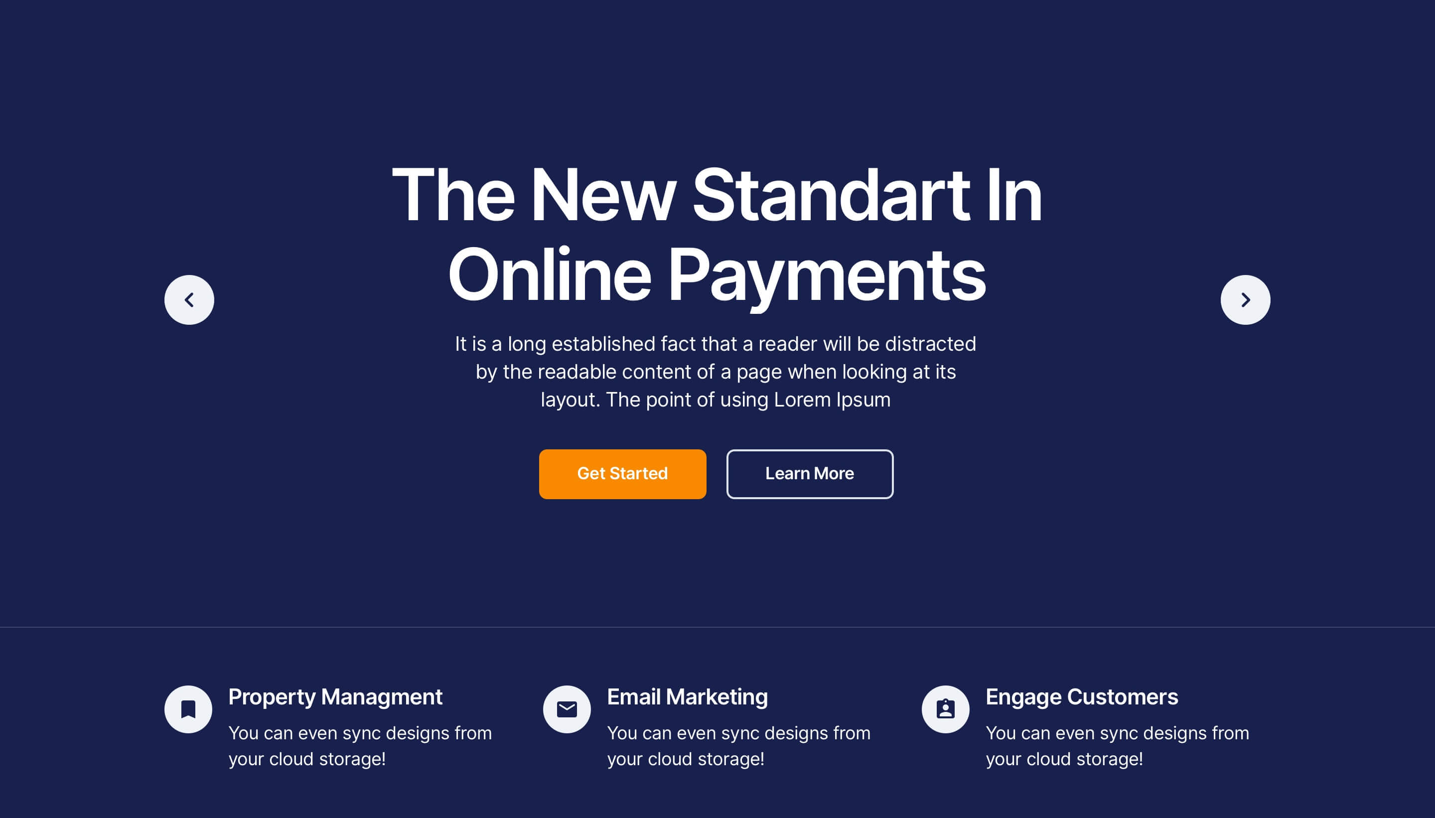
You can do that in an icon section like this…
Or you could add a video to the panel like this…
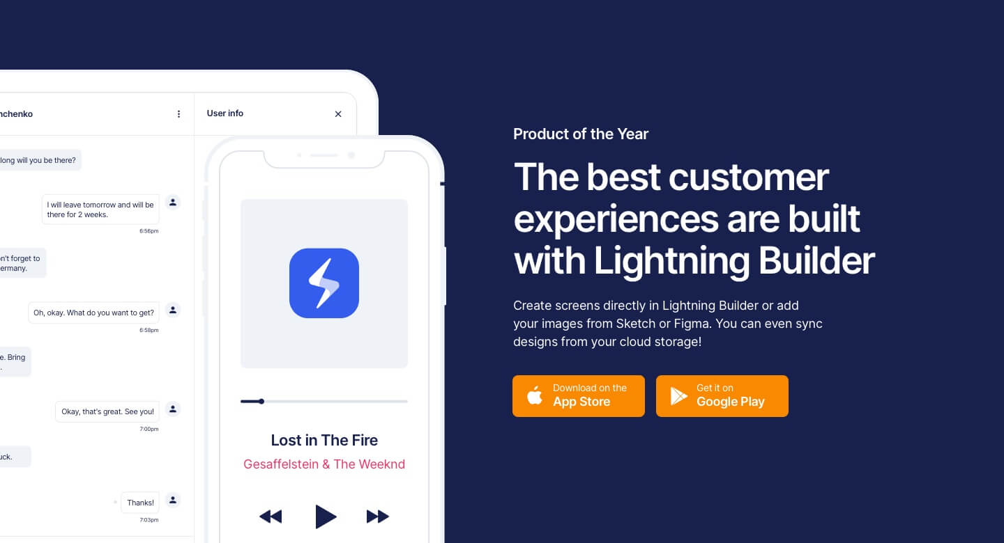
Add some dot points to accompany a graphic or illustration…
Or take the image full screen for something a bit more dramatic.
But ultimately, all of the copy on your website (especially your headlines) should be speaking directly to the benefits your service or product provides the user. Like we are doing here on this client website build…
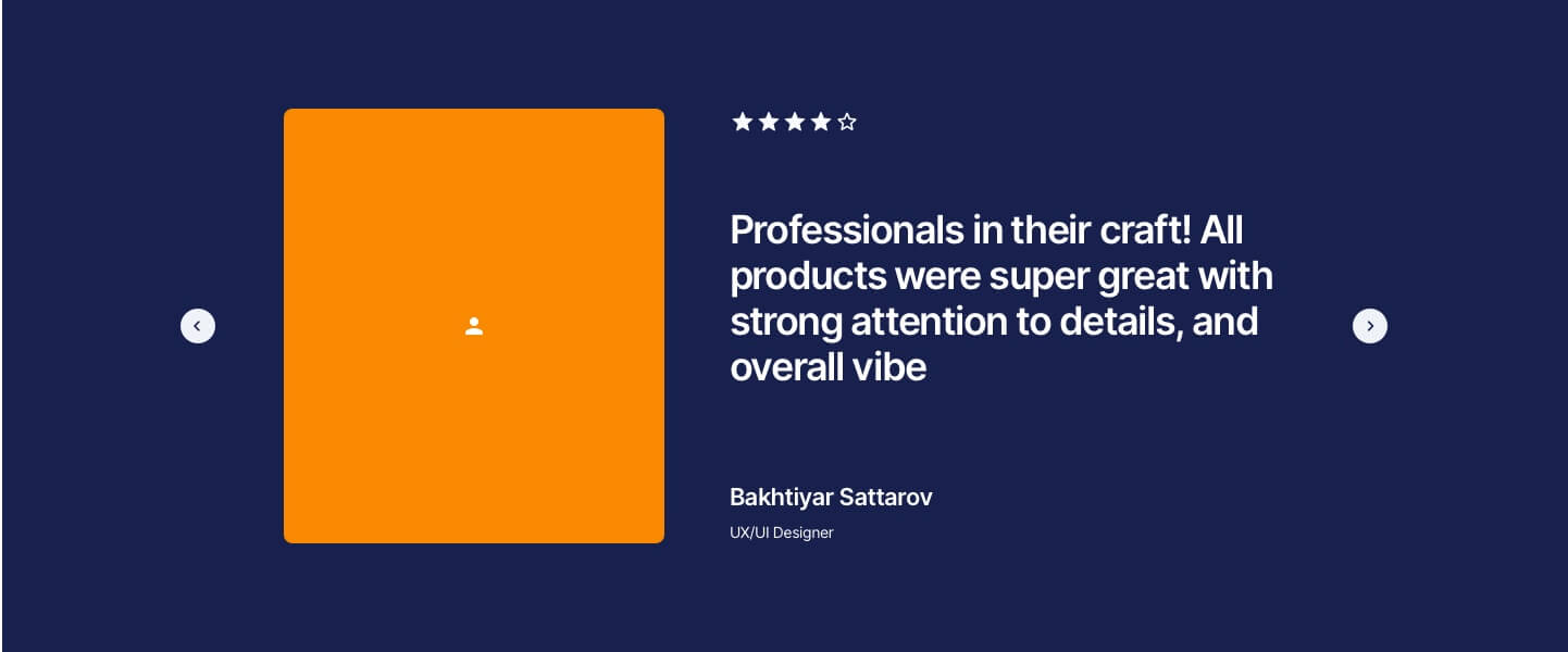
Tip #9: Show social proof in your homepage design
A great pitch is good. But a great pitch backed by actual testimonials, success stories, customer reviews, and awards is even better. So, make sure you showcase them on your homepage.
You could do videos like this…
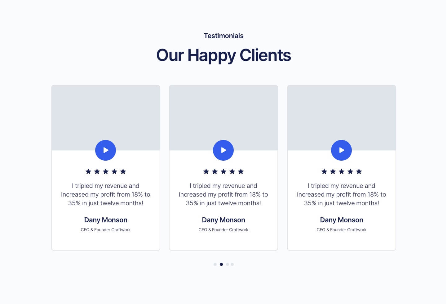
Or just written testimonials with a profile photo…
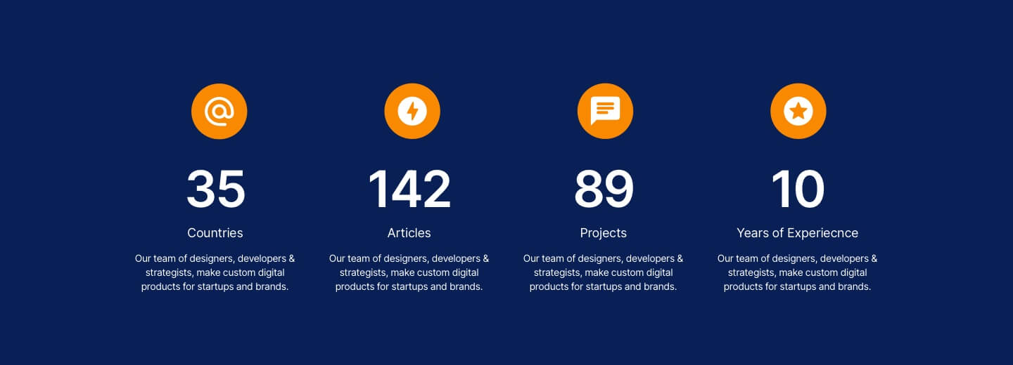
Or use counters or statistics to add credibility to your claims…
…to name a few.
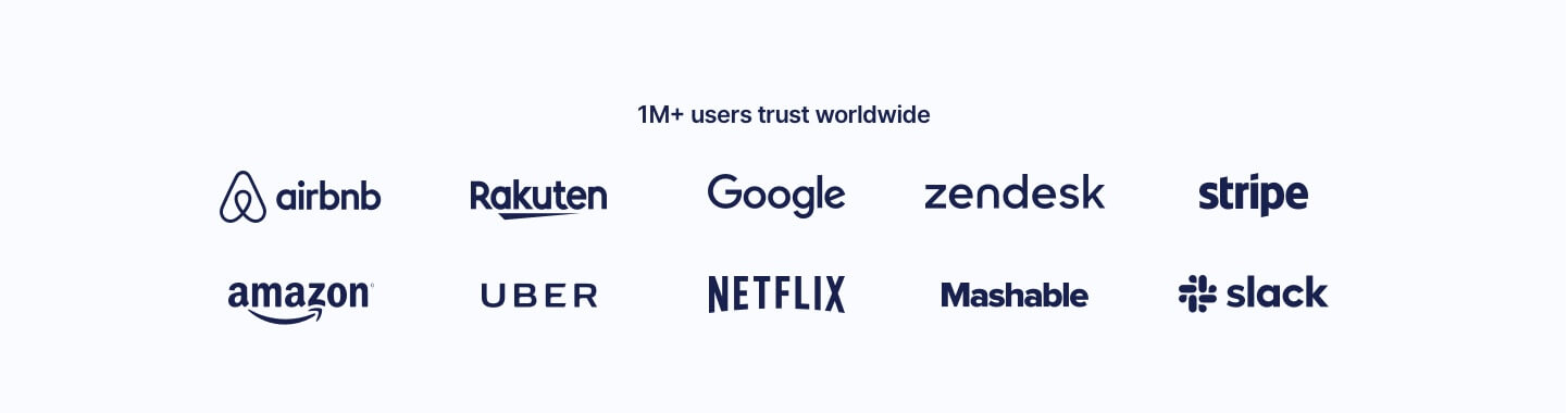
Also, if you work with established brands, make sure you add a section to display their logos too. Doing so gives you credibility by association. Here’s how that can look…
Tip #10: Don’t forget to follow up
Half of sales happen after the fifth contact—that’s according to XANT CEO Chris Harrington. So, if you don’t have an automated email follow up sequence or do retargeting, you’re essentially throwing 50% of your sales away.
We recommend Ontraport, Active Campaign or Copper as our tools of choice for this. But what about if you don’t have the clients email address?
To follow up clients who land on your website but don’t leave their contact details through a form use tracking pixels from Facebook and Google to serve ads to these users and prompt them back to your website to take action. This is known as Remarketing.
Tip #11: Mind your copy
The main thing most businesses get wrong with their copy is they focus on who they are and what they do instead of on what the prospect needs and wants to see.
As a general rule, as long as you concentrate on showing them what they’ll get out of sticking around and buying from you—all while addressing potential objections along the way—you’re golden.
Of course, there’s also the more technical side of writing persuasive copy. You need to be able to craft ultra-compelling headlines and arrange everything in a way that each sentence and section flows naturally into the next and guides the prospect to the action you want them to take.
Tip #12: Use landing pages in your homepage design
Want to make conversion even easier? Use landing pages instead.
Unlike ordinary homepages, landing pages are designed to do just one thing—such as sell an eBook, get sign ups for an event, or get pre-orders for a specific product—and nothing else.
This means you know exactly what type of prospect you need to attract and what kind of offer you need to craft to close the deal.
A high converting landing page could look as simple as this…
…or could have more content to explain the benefits or the resource or product.
Tip #13: Optimise for search engines (specifically Google)
Everyone uses Google to search for everything—including whatever it is you’re selling. Getting your SEO game on point allows you to be one of the top results whenever people do a search related to your products and services.
We use and recommend SEMRush for reviewing and optimizing your website.
Tip #14: Make your homepage design look awesome!
It doesn’t matter how good your pitch is, if your homepage design looks terrible, you will lose a lot of potential sales. So, make sure it’s designed to wow the prospect within the first few seconds. Need some inspiration of great looking homepages? Take a look at our portfolio, I’m sure you’ll love what you see.
And that’s it! Fourteen simple tips to help you get more leads and conversions.
Before you go, if you need help building a high-converting website then book a time in with one of our team here: www.lightningsites.com/call/